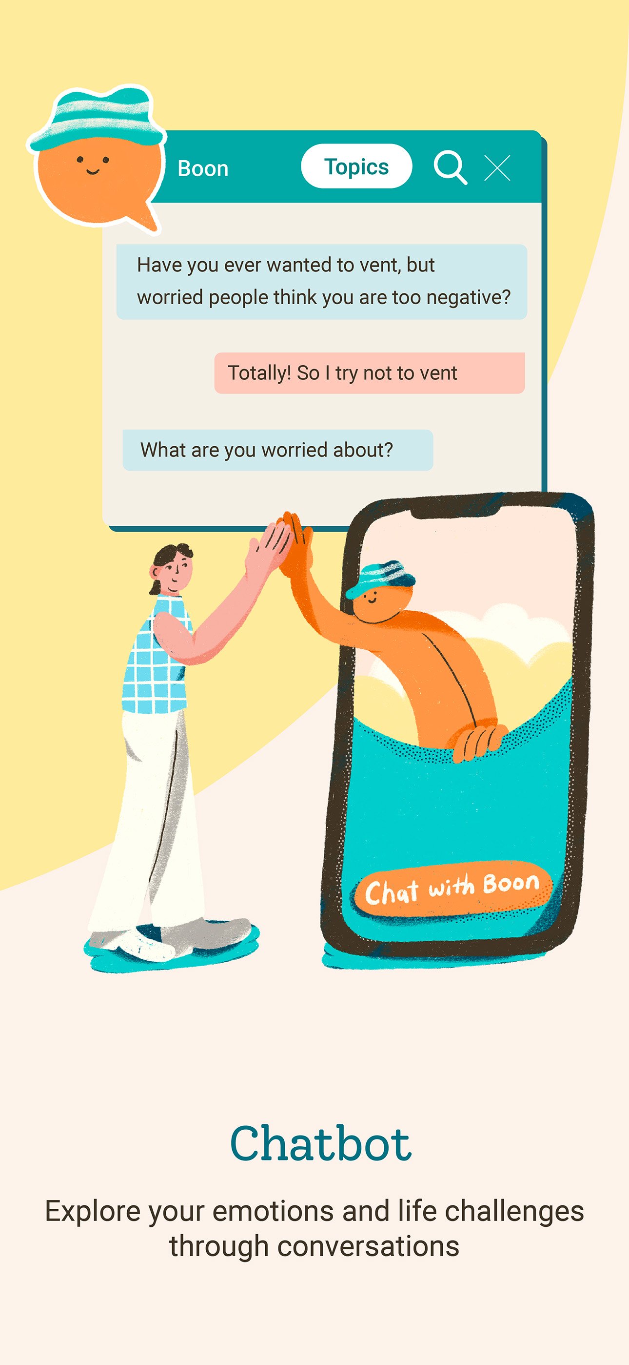
The introduction of new chatbot as the platform mascot
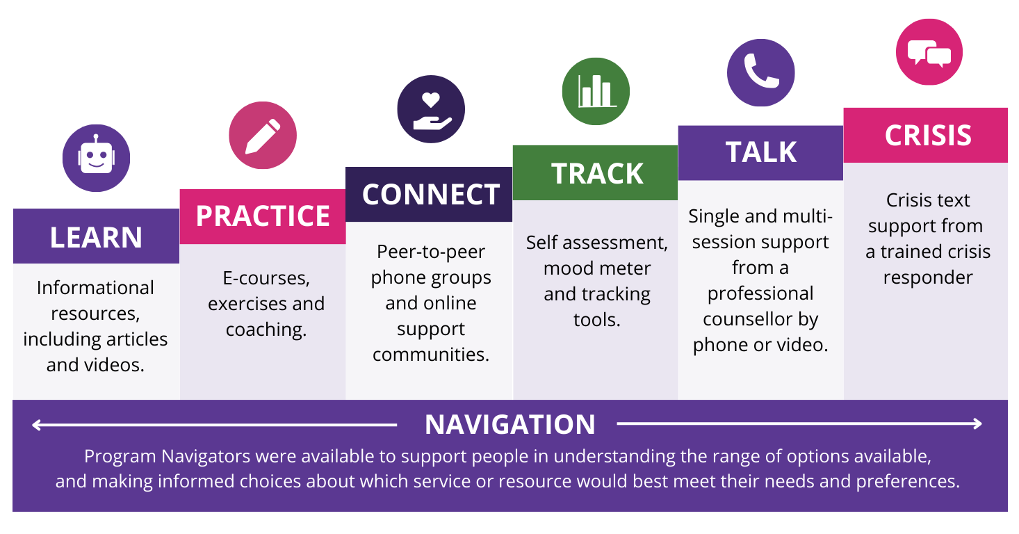
The Challenge
- The platform had users, but was losing them mid-course. The real problem was that the experience was cognitively exhausting the exact people it was trying to help.
- For someone already experiencing anxiety or depression, a wall of text & an unclear starting point isn't just bad UX. It's a barrier to care.
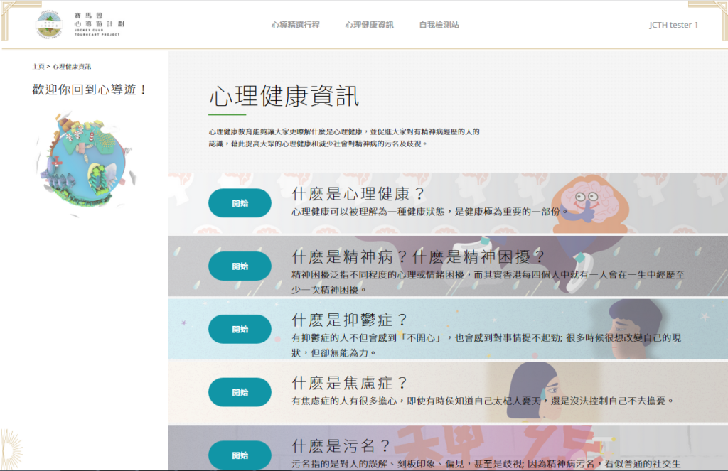
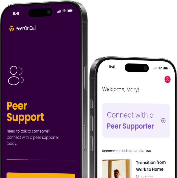
The old version of the platform interface
What I Did
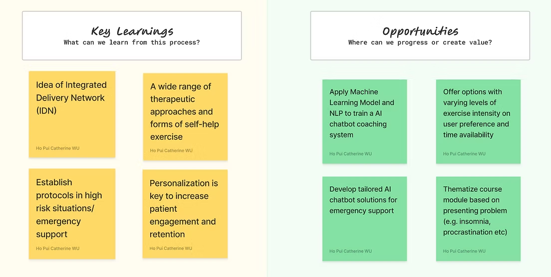
- Defined the step-up/step-down recommendation logic that became the backbone of the AI chatbot
- Led competitive analysis to identify engagement patterns from apps like Calm and Headspace that the platform could adapt
- Collaborated with UI designers and engineers to redesign content delivery and build the recommendation system
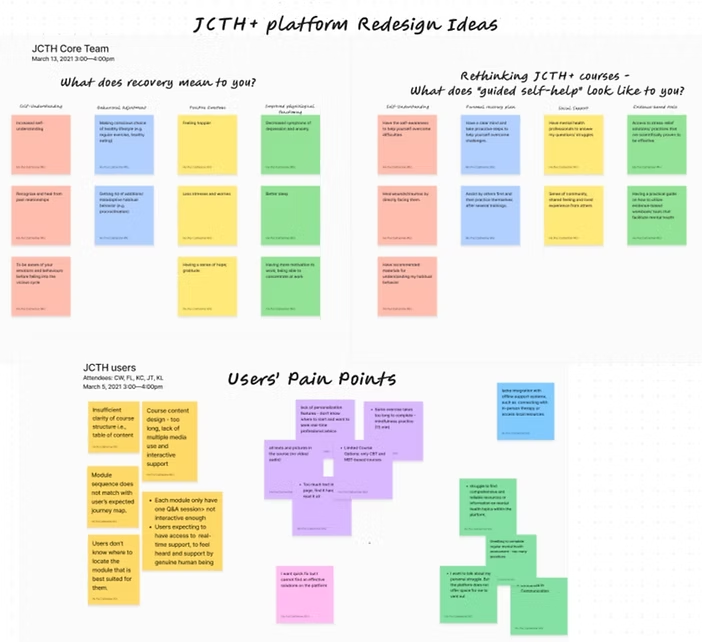
Findings organized via an affinity diagram
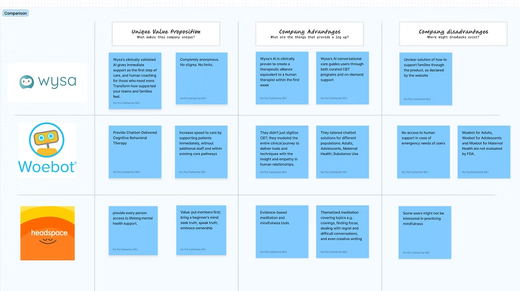
Competitor Analysis: Learning from similar apps
Key Decisions
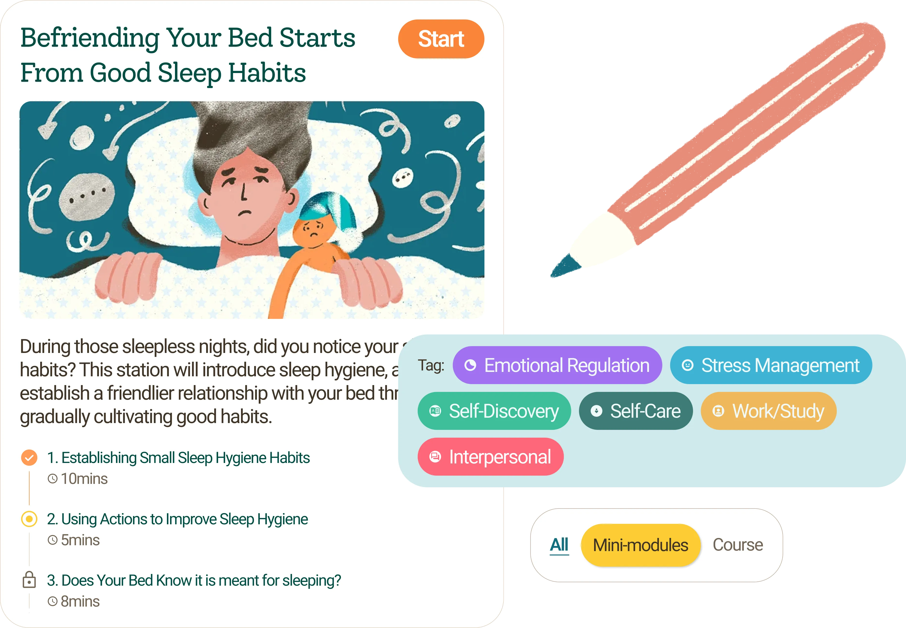
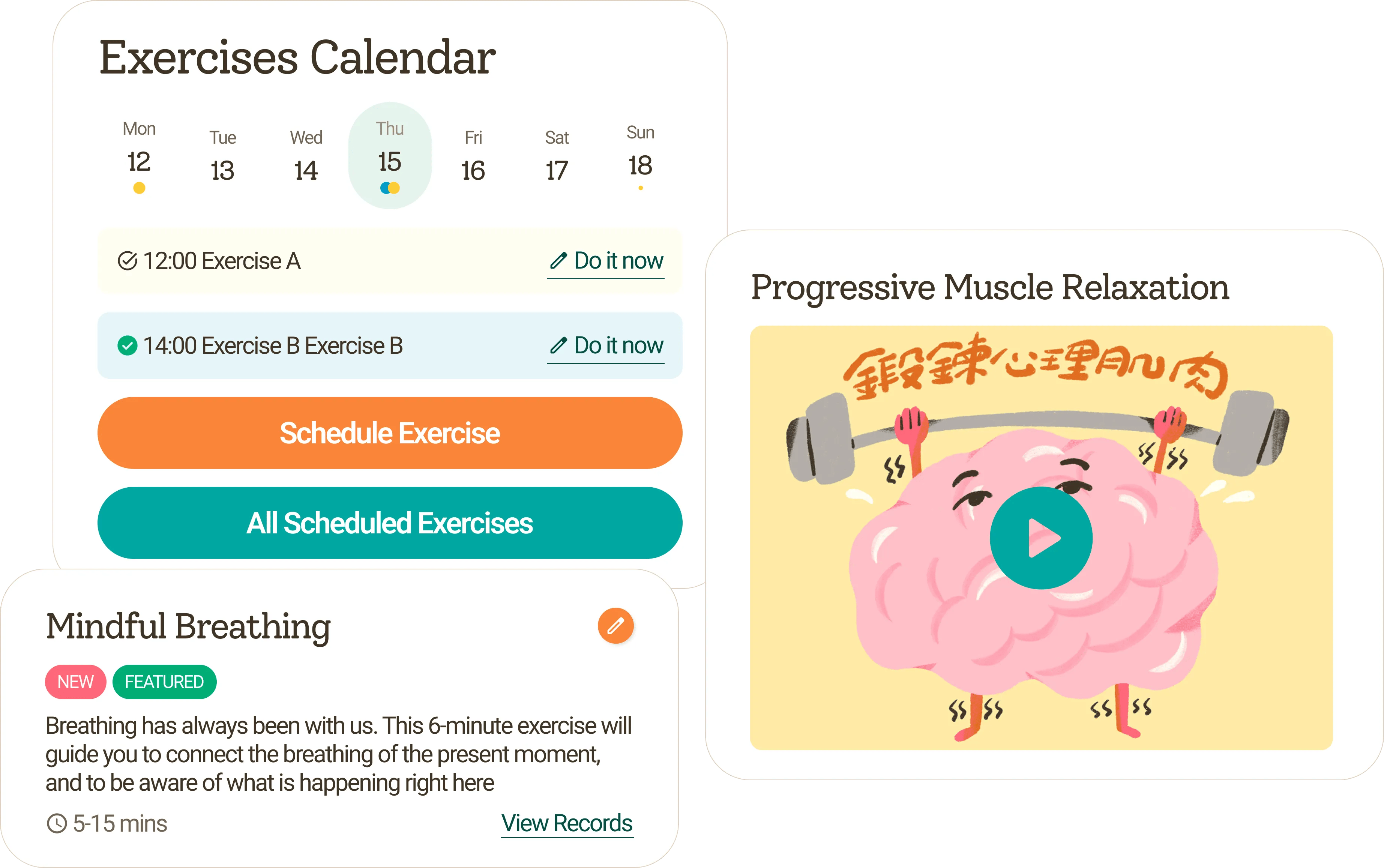
- Broke long modules into bite-sized segments with visible duration tags.
- Built a "My Library" bookmarking layer instead of burying exercises inside modules.
- Replaced the open catalogue with a short assessment that generated a personalised starting point. For users in distress, direction beats choice.
Venice, and a moment between two.
Outcome
- Course completion rate up 21.8%
- Users returning to modules up 42.7%
- Platform repositioned from static resource library to interactive AI-guided companion
- Users described the platform as "truly helpful, very approachable and very supportive" - language reflecting emotional safety, not just functionality
A spontaneous rhythm, a shared moment, pure joy.
Key takeaways:
- Good UX in mental health isn't about delight - it's about removing friction at the exact moment one has the least capacity to push through it.
- Every decision on this product was filtered through a question: would a person in moderate distress still complete this step? When the answer was no, we simplified until it was yes.